While there are a multitude of different charts
available to trade currencies, I will be focusing on the three main ones that
you see time and time again. They will be the simple line chart, bar chart, and
the candlestick chart. They all have their various quirks, and of course pros
and cons.
Line charts
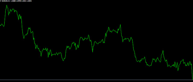
Line charts are simply a chart that's representative
of closing prices, drawn as a line on the chart. It is the most basic type of
charting, and one that you will already be familiar with. If you were to look
at the granularity of the chart, what essentially happens is that there is a
dot that is plotted for every closing price for that period, for example a
daily close, and then those dots are connected in order to place a line on the
chart. This is the most basic of charts that you can find, as it simply shows
you where the market closed at various days, but not necessarily how it got
there.
That being said, it does show you what the trend is,
whether a market has been rising or falling rather quickly. It doesn’t give you
a lot of information, but if you are a trend following trader that is using
multiple small positions, it might be enough. If you're a fundamental trader,
very often a line chart is enough also . Below is an example of a line
chart:
Bar charts
Bar charts are also a very common type of charting
that you will see in the Forex markets, as they have been trusted by
professionals for decades. They are particularly common for other markets such
as the stock market in the commodity market, and many of the older traders out
there continue to pay attention to them. Unlike the road chart, there's more
information than simply the close of the time-frame.
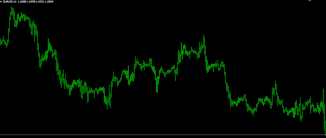
In the chart below, there is the exact same EUR/USD
chart that we had looked at in the line chart but zoomed in a little bit so
that you can see some of the nuances when it comes to a bar chart. You will
notice that each of the bars has a vertical line, with two horizontal “ticks”
on each side. This is what makes the bar graph different than the road chart,
and far more useful. The tick on the left-hand side of the | shows the opening
price, while the one on the right-hand side of the bar shows the closing price.
The | itself shows the high and the low of that bar, in this case that day. In
other words, if the tick on the left-hand side is below the tick on the
right-hand side, you know that the closing price was higher than the opening
price. In other words, the worth of the asset has risen.
You can then extrapolate from there whether we can
hang on to the gains, or even the losses. For example, if you have a bar that
has shown that we close higher than the open but gave back a lot of the gains
during that time, that might show signs of exhaustion as opposed to a line
chart which would simply show a slight “bump higher.” Because of this, bar
charts are much more desirable than line charts, because they can show when
momentum may be slowing down much quicker than a line chart can.
Candlestick charts
Over the last couple of decades, we have seen a
surge of candlestick use when it comes to charting package is, especially in
the Forex world. Candlestick charts give you the exact same information as a
bar chart, but they added color coding into the mix, allowing you to see the
trend much quicker. If you have experienced trading, you can use either bar or
candlestick charts to the same effect. However, they are a bit simpler, as
there is a “body” that is colored green or red, or sometimes white and black.
If the candlestick is using the green and red color scheme, green means that
during that timeframe, prices appreciated. Red of course means that prices fell.
In the black and white color scheme, a white candlestick is positive, while a
black candlestick is negative
.
As I mentioned previously, this is the identical
information you get from a bar chart. The thicker part of the candlestick,
known as the “body”, shows where we opened and closed during the time talked
about. The top of the thick body of the candle stick is one of the tics that we
see in the bar chart, just as the bottom of it is as well. The way you
differentiate between the open and the close is the color of the body. For
example, if the body is red, then it means that the opening price is at the top
of the body, while the closing price is at the bottom of the body, thereby
making it a negative candle. As far as the high and the low of the candle is
concerned, it would be the “wicks” that you see on the candlestick, which
extend from the body either higher or lower, depending on which side of the
candlestick you are talking about.
The main advantage of using the candlestick chart is
that if you see several green candles in a row, then it’s a quick way to glance
at the chart and understand that we are in and uptrend. There are various
candlestick patterns that people talk about, such as a “spitting top”, a
“shooting star”,” bearish and golfing candlestick”, and many others. However,
every single one of those candlesticks have a similar counterpart on the bar
chart.
In the end, use what you are comfortable with, but
line charts don’t give us enough opportunity to understand what is going on
during the candlestick, just the direction that the market is moving overall.


1 comments:
Click here for commentsI LOVE YOU AND YOUR WORK AT ALL TIMES,I AM AN ARDENT FOLLOWER PLEASE KEEP UP THE GOOD WORK.EXCELLENT PIECE!
ConversionConversion EmoticonEmoticon